
Redefined meal tracking by shifting from calorie logging to habit formation.
My Role
Founding UX & Product Designer
Team
Timeline
December 2025 - April 2026

Overview
Nutrish is a subscription-based meal planning product built around a weekly check-in. Users receive structured weekly meal plans and must submit updated weight before generating a new cycle.
The solution
Outcomes
Design
Owned product design, defining information architecture and interaction systems.
Strategy
Defined product’s commitment and cycle logic to improve weekly engagement.
XFN Work
Worked directly with founders to define roadmap, scope MVP, and ship core features.
Early concept
Founders were advocating for a binary reset
With a high concern for nutritional accuracy, I was encouraged to explore forcing an immediate reset after a user doesn’t complete weekly check-in. After creating several iterations, I rethought the connection between:


The hard reset created room for manufacturing churn


I communicated how our initial research didn't support this feature
The problem
The required action was becoming a drop-off trigger
Weekly check-in was essential, without updated weight and progress data, calorie targets could not adjust properly. From a nutritional standpoint, it was non-negotiable.
An early interpretation of the model was:

If we interpreted short lapses as abandonment, we risked manufacturing churn. If we ignored missing data, we compromised nutritional accuracy.
The solution
Escalate friction in proportion to behavioural risk


The tradeoff I made was accepting short-term imprecision in calorie targets in exchange for temporary continuity
Projected impact: Industry data shows pause and flexibility options convert approximately 19% of users who would otherwise cancel.
Visual language
I defined the visual system to a warmer palette so weekly check-ins and enforcement moments felt supportive and human


First iteration
First concept using the old marketing-site system, closely aligned with Nutrish’s original AI-focused brand and cooler look.


Final design
I iterated the visual system and chose warmer colours so enforcement moments feel supportive and human, not clinical.
Defining features
Designing a meal planner built for real life.

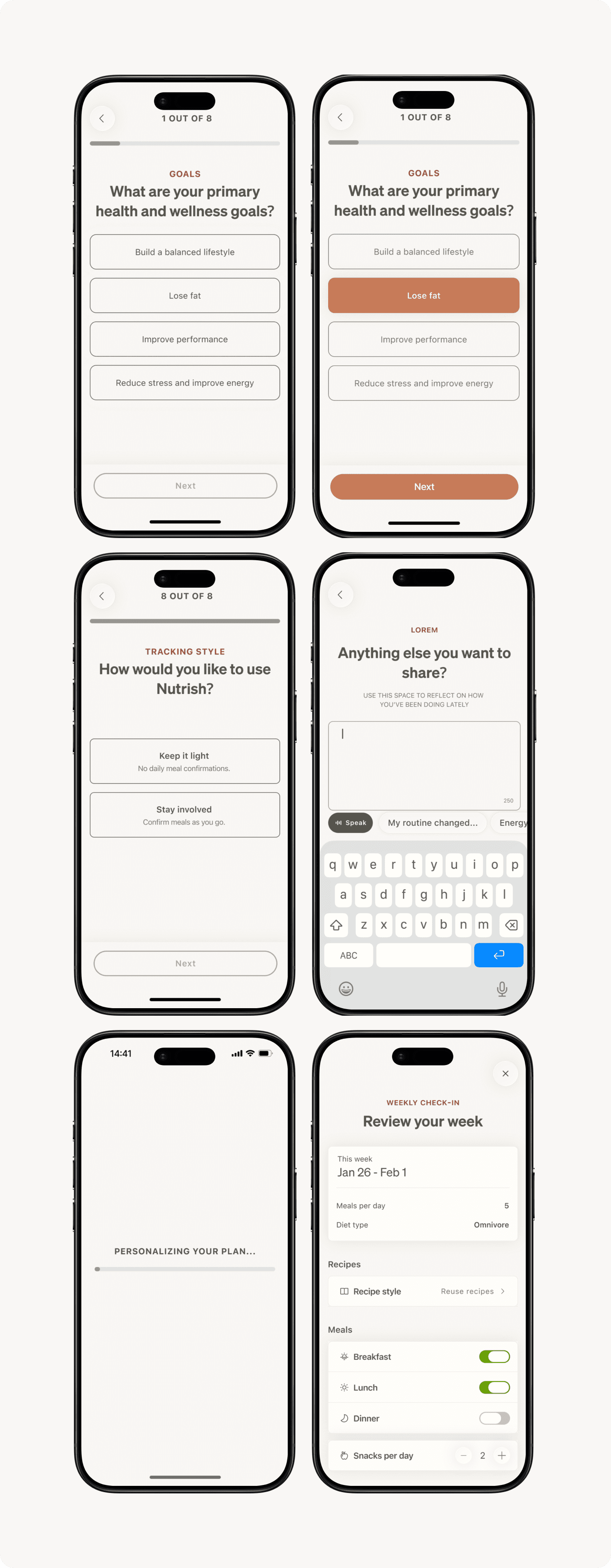

Onboarding as commitment architecture
A common failure in AI-assisted products is a layer that feels bolted on. I wanted to avoid that entirely. Working closely with the engineer, I defined its behavioural logic from the ground up: what it could surface, when, and under what conditions.
Projected impact: ~25% lift in early check-in completion, based on research linking rationale transparency to follow-through in requirement-heavy onboarding.


Building an AI layer that makes meal planning effortless
A common failure mode in AI-assisted products is a layer that feels bolted on. I wanted to avoid that entirely. Working closely with the engineer, I defined the AI’s behavioral logic from the ground up: what it could surface, when, and under what conditions.
Projected impact: 20%+ improvement in plan adherence, based on research showing personalized AI-driven reminders outperform generic nudges in sustaining compliance.
learnings and impact
Diving into design with no nutrition knowledge
Product design at early-stage is not about adding features. It’s about deciding what not to enforce.
The most important design decisions were invisible — they shaped how the system interprets human behavior. And that interpretation directly impacts retention, trust, and long-term revenue.
Speaking up for design
The UX team consisted of only 3 people, and the nature of our work was very stakeholder centric. Using research as a driver for design work was something that had to be fought for, and although the company has many ways to improve, advocating for certain process changes and design decisions has improved the quality of my work and streamlined our team.



